vivo Brand Identity Redesigned

2019 seems like a year for a new logo and brand identity. vivo joins the bandwagon by unveiling their latest visual identity which consists of a new company logo, brand colour and exclusive Chinese and English vivo fonts.
vivo partnered with renowned Danish designer Bo Linnemann to design the new logo. The new logo features simplified lines and sharpened angles to reflect the forward-looking spirit of vivo.
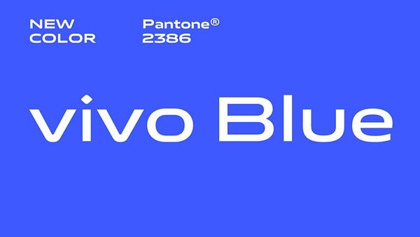
The company has also revamped its “vivo Blue” colour by using a more saturated shade of blue as a result of a study by vivo to better understand consumer visual habits and their visual receptiveness to digital displays. The new colour is deemed more soothing to the eye and the colour is the ideal visual backdrop for the company’s creative and expressive character.
vivo has also revealed its English Language vivoType font, which comes with 6 weights and 2 widths, plus the Chinese Language vivoType font in 2 weights, to ensure that the fonts can be adapted seamlessly to different regions and languages. The new English Language and Chinese Language vivoType fonts are designed by Bo Linnemann and Chinese calligrapher Qiu Yin respectively.
“vivo is not only an industry leader in smartphone technology but also a brand that is willing and genuine in its communications with consumers. Building on vivo’s strong international visibility and influence, this new visual brand identity will better channel the brand’s character and attractiveness,” said Bo Linnemann, Contributing Designer to vivo’s branding project.


